Unit 3. Color Theory How to plan and use color.
COLOR WHEEL:

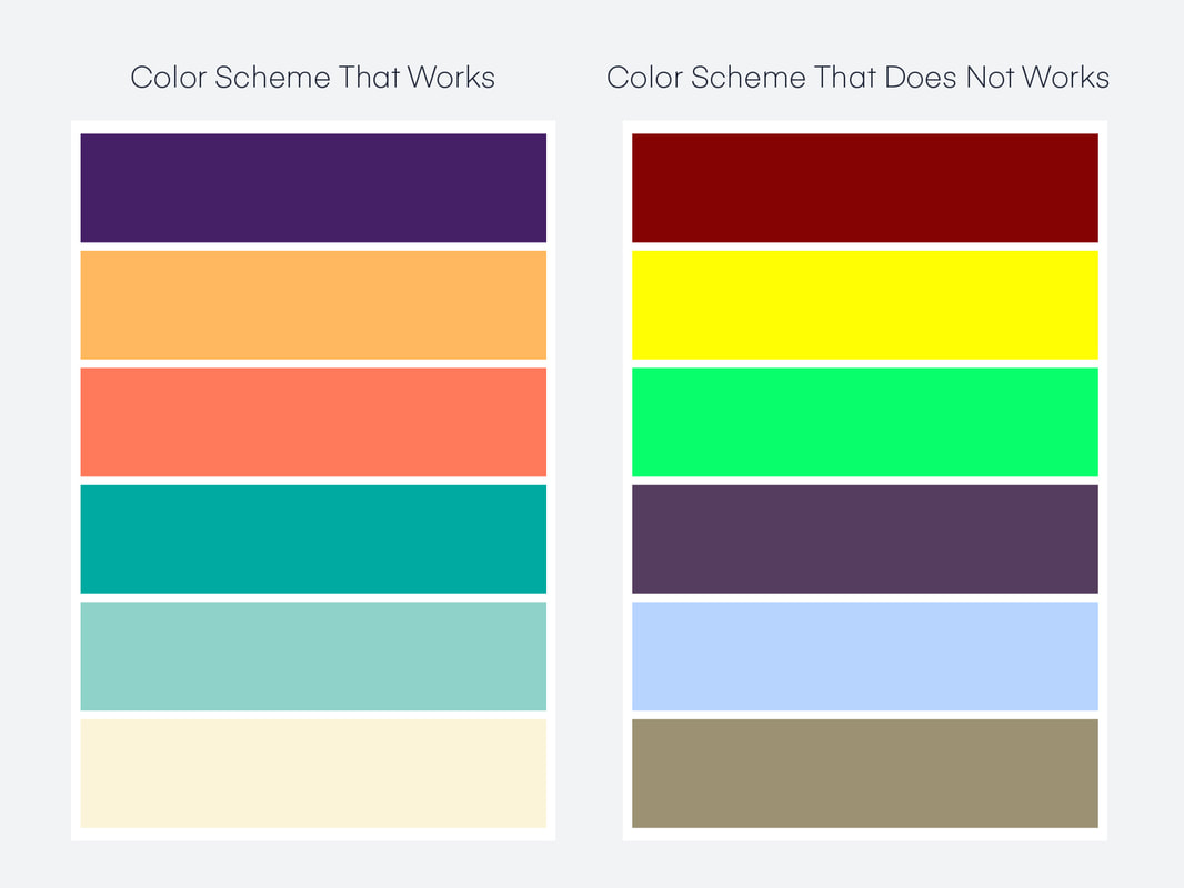
COLOR HARMONY:

Color Harmony Formulas
There are many formulas of color harmony. The basic ones refer to the analogous color schemes, as well as complementary, semi-complementary, split-complementary schemes, and also triadic, rectangle or tetradic, and square color schemes. And here comes the explanation for each and every one if those schemes.
Analogous colors are any three colors which are side by side on a 12-part color wheel, such as blue-green, green, and green-yellow. Usually, one of the three colors is dominant and other two follow. Analogous color schemes are often found in nature. Those are usually highly harmonious and pleasing to the eye, so they create comfortable designs.
Complementary colors are any two colors directly opposite each other when observed within the color wheel. For example, complementary colors are red and green, or blue and yellow, and everything in between which creates maximum contrast for a vibrant look. Complementary color schemes are good to use when something needs to be pointed out.
Split-Complementary colors are the complementary color scheme variable. Instead of one complement to a color, this scheme uses the two colors adjacent to its complement. The result is the same strong visual contrast, but a little less intense. A split-complementary scheme is really easy to implement, thus could be a good choice for beginners in a color theory field.
Triadic colors are the ones that are evenly spaced around the color wheel. Triadic color schemes tend to be quite vibrant, even if the unsaturated versions of a hue are in use. But, in order to have a successful harmony, one color should predominate, and the other two should be used for accent.
Rectangle or tetradic color scheme uses four colors that are arranged as two complementary color pairs. It is a rich scheme that offers many possibilities, with one color as a leader, and other as followers. If using this scheme, a special attention should be paid to the balance of warm and cool colors.
Similar to a rectangle, the square color scheme has four colors, but all four are spaced evenly around the color wheel. However, one color should be dominant, and the focus has to be on making harmony with well-balanced warm and cool colors.
TINT VS. SHADE

Use These!
Why Are Colors Important?
Visual unity Visual unity is best described as harmony, which is a design principle in its own right. It can apply to colors, using styles that work well together, and in some cases, repeating styles to maintain visual consistency.
For example, visual unity could be considered when choosing two different colors that need to complement each other well (harmony), or choosing the same color for two different buttons because they’re equally important (repetition).
For example, visual unity could be considered when choosing two different colors that need to complement each other well (harmony), or choosing the same color for two different buttons because they’re equally important (repetition).

Color Psychology
Color evokes feeling. It incites emotion. And it’s not any different when it comes to selecting colors for your business.Choosing the right colors for your marketing efforts can be the difference between your brand standing out from the crowd, or blending into it.
Color evokes feeling. It incites emotion. And it’s not any different when it comes to selecting colors for your business.Choosing the right colors for your marketing efforts can be the difference between your brand standing out from the crowd, or blending into it.
energy, war, danger, strength, power, determination as well as passion, desire, and love- also known to make people hungry!

Red Color PsychologyMarketing colors like red can capture attention. The red color meaning is associated with excitement, passion, danger, energy, and action. You might’ve noticed that some brands use red for ‘order now’ buttons or for their packaging as a way to stand out on the shelf. In color psychology, red is the most intense color. And thus, can provoke the strongest emotions. Red can also trigger danger so you want to use the color sparingly. If you add the color red to your website, save it for the call to action or sale icons if it’ll contrast well with your store design.
Red is the iconic color used for brands like Coca Cola and YouTube. The color red tends to encourage appetite hence why brands like Coca Cola use it often in their branding. They also use words like happiness in their branding so they use the color red to build excitement. YouTube likely uses the color red due to the excitement of watching videos online. Notice how the red part of their logo is the play button which can help compel someone into action. It encourages you to want to press play on their videos.
Red is the iconic color used for brands like Coca Cola and YouTube. The color red tends to encourage appetite hence why brands like Coca Cola use it often in their branding. They also use words like happiness in their branding so they use the color red to build excitement. YouTube likely uses the color red due to the excitement of watching videos online. Notice how the red part of their logo is the play button which can help compel someone into action. It encourages you to want to press play on their videos.


Elements and Principles:
ELEMENTS OF ART: The visual components of color, form, line, shape, space, texture, and value. Line An element of art defined by a point moving in space.
Line may be two-or three-dimensional, descriptive, implied, or abstract.
Shape An element of art that is two-dimensional, flat, or limited to height and width.
Form An element of art that is three-dimensional and encloses volume; includes height, width AND depth (as in a cube, a sphere, a pyramid, or a cylinder). Form may also be free flowing.
Value The lightness or darkness of tones or colors. White is the lightest value; black is the darkest. The value halfway between these extremes is called middle gray.
Space An element of art by which positive and negative areas are defined or a sense of depth achieved in a work of art .
Color An element of art made up of three properties: hue, value, and intensity. • Hue: name of color • Value: hue’s lightness and darkness (a color’s value changes when white or black is added) • Intensity: quality of brightness and purity (high intensity= color is strong and bright; low intensity= color is faint and dull)
Texture An element of art that refers to the way things feel, or look as if they might feel if touched.
PRINCIPLES OF ART: Balance, emphasis, movement, proportion, rhythm, unity, and variety; the means an artist uses to organize elements within a work of art.
Rhythm A principle of design that indicates movement, created by the careful placement of repeated elements in a work of art to cause a visual tempo or beat.
Balance A way of combining elements to add a feeling of equilibrium or stability to a work of art. Major types are symmetrical and asymmetrical.
Emphasis (contrast) A way of combining elements to stress the differences between those elements.
Proportion/Placement A principle of design that refers to the relationship of certain elements to the whole and to each other. USE ALIGNMENT and the RULE OF THIRDS! (z pattern/ f pattern)
Harmony A way of combining similar elements in an artwork to accent their similarities (achieved through use of repetitions and subtle gradual changes)
Variety A principle of design concerned with diversity or contrast. Variety is achieved by using different shapes, sizes, and/or colors in a work of art.
Movement A principle of design used to create the look and feeling of action and to guide the viewer
